Brand identity design is the process of turning what your business stands for into a consistent visual and verbal system: a logo, a colour palette, typography and usage rules. For a founder preparing a launch, it runs through five stages: discovery, strategy, logo, colour and type, then final assets. Finish all five and your website goes live looking credible.
| Stage | What you produce | Key decision | Who must sign off |
|---|---|---|---|
| 1. Discovery | Audience notes, competitor review, values list | Who is this brand for, and who is it not for? | Founders |
| 2. Strategy | Positioning statement, three brand words, tone of voice | How do we want to be described in one sentence? | Founders |
| 3. Logo | Primary logo, compact mark, one-colour version | Wordmark, symbol or both? | Founders and designer |
| 4. Colour and typography | Palette with roles, type pairing, type scale | Which colour carries buttons and links? | Designer and developer |
| 5. Final assets | Brand guidelines, logo files, Figma styles, web tokens | What is the usage rule for each asset? | Designer, developer, founders |
Brand identity design is the creation of the visible and audible parts of a brand: logo, colours, typography, imagery and tone of voice. A founder launching a website needs a small, consistent version of this, not a full corporate system. The goal is that every page looks like it came from the same company.
People mix up three terms. Your brand is what customers believe about you. Your brand identity is the set of assets you control to shape that belief. Your logo is only one asset inside it.
For a startup, the minimum viable identity is short. You need a logo in a few formats, a palette with named roles, two typefaces, a few rules for spacing and imagery, and a sentence describing how you sound. Everything else, such as packaging, event banners or a full illustration library, can wait until after launch.
At Axire Infotech we are a digital development studio, so we come at this from the website side. Our digital branding work covers brand identity and visual design, and we run it alongside UI/UX design so that the identity is built for screens from day one, not retrofitted.
Discovery is where you collect the facts the rest of the identity depends on. It covers your audience, your competitors, your values and the problem you solve. A weak discovery stage produces a logo that looks fine and says nothing. Treat it as the cheapest place to find disagreements between founders.
INSEAD's guidance on building a brand pyramid recommends one-on-one interviews with key stakeholders, with questions sent in advance, and meetings of between 60 and 90 minutes. For a startup, the stakeholders are usually the two founders plus anyone who talks to customers weekly.
Ask each person the same questions separately. What do customers say when they first call? Which competitor do we least want to resemble? What would we never say in a sales email? Compare the answers afterwards. The differences are your real agenda.
The IED design school describes identifying core values as the first step in building an authentic brand image, followed by an internal process of analysis and brainstorming. Keep your list to three or four values. A list of ten values is a list of none.
Then describe one primary buyer in plain terms: role, company size, what they are trying to get done, and what makes them hesitate. If your launch audience sits in Europe, note the markets, since tone and imagery that work in London may read differently in Stockholm or Amsterdam.
Collect screenshots of five competitors' homepages and put them on one page. Mark the colours, logo styles and photo choices that repeat. If every competitor uses blue and a geometric sans-serif, you now know what blends in. That is the gap your identity can use.
Hypothetical worked example. Suppose a two-founder startup is launching scheduling software for small clinics. Discovery shows that competitors all use pale blue and stock photos of smiling staff. Both founders say customers describe their product as "calm and fast". That phrase becomes input for stage two.
Strategy converts your notes into decisions a designer can act on. It produces a positioning statement, three brand words and a short description of tone of voice. Without it, design reviews turn into arguments about personal taste. With it, you can ask a simple question: does this look match our three words?
Use one sentence that names three things: the audience you help, the outcome they get, and the pain you remove. Fill in real details from discovery. For the clinic example: "We help small clinics fill their diaries without phone tag." If the sentence needs two "and" clauses, you have two products or no focus yet.
Choose three adjectives, then attach a design rule to each. "Calm" might mean generous white space and a restrained palette. "Fast" might mean short headlines and no decorative animation. A word without a rule is decoration. A rule gives the designer something to build and gives you something to check.
Write what you sound like, what you never sound like, one sample headline and one sample button label. Your website copy, error messages and emails all draw on this. It also informs UI text, which is why identity work belongs close to product design.
Decision rule: if the founders cannot agree on the three words in one sitting, do not start logo work. Run a second round of interviews instead. Logo concepts built on a disputed strategy get rejected for reasons nobody can name, and that costs more time than a second interview round.
A logo should be recognisable at 16 pixels in a browser tab and still look good on a wide website header. Design it for those two extremes first. Most startup logos fail on size, not style, because they were drawn large and shrunk later.

Each format suits a different situation. Choose based on how well known your name is and where the logo will appear most often.
| Format | Best when | Watch out for |
|---|---|---|
| Wordmark (name only) | Your name is short and distinctive | Hard to shrink into a square favicon or app icon |
| Symbol only | The brand is already known | New brands get no name recognition from a symbol alone |
| Combination (symbol plus name) | Most launches | Needs a stacked version and a compact version |
For most founders, a combination mark with a separate compact symbol is the safe choice. The symbol serves as your favicon and app icon. The full lockup sits in the header and on documents.
Ask for three directions at most. More options slow decisions and rarely improve the result. Each direction should trace back to a brand word from stage two.
Colour and type do most of the work on a website, because they cover almost every pixel. Decide them as a system with roles, not as a list of favourite hex codes. A role-based system also hands developers exactly what they need to build components consistently.
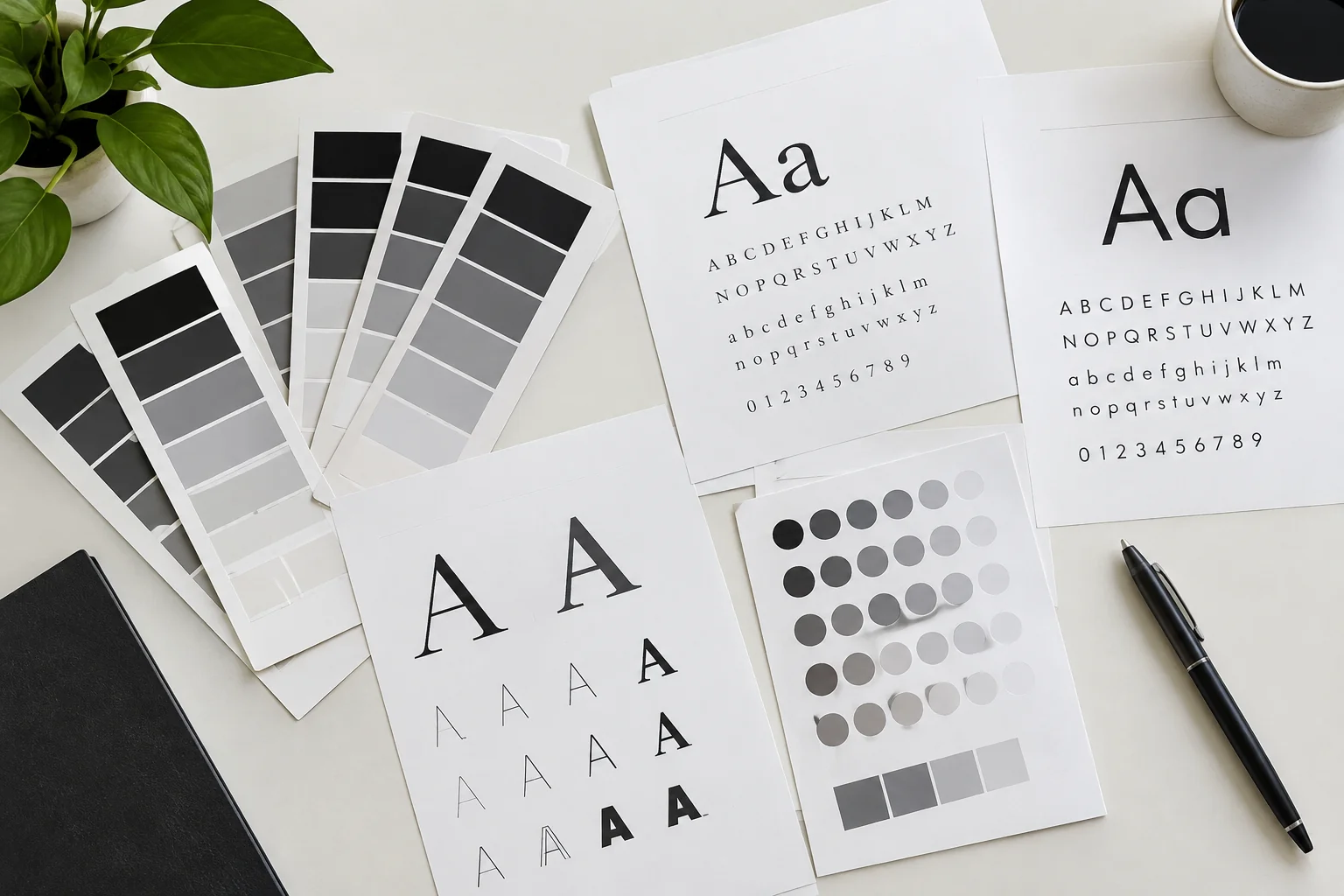
A launch palette needs about four jobs filled. Anything beyond that can be added later when the product demands it.
| Role | Purpose | Guideline |
|---|---|---|
| Primary | Buttons, links, key highlights | One colour, used sparingly so it stands out |
| Neutral scale | Text, backgrounds, borders | Five to seven steps from near-white to near-black |
| Accent | Badges, secondary highlights | Optional; one colour only |
| Feedback colours | Success, warning, error states | Keep distinct from the primary colour |
Check contrast before you fall in love with a combination. Under WCAG 2.2 Level AA, regular text needs a contrast ratio of at least 4.5:1 against its background, and large text needs at least 3:1. Light grey text on white and pastel buttons with white labels are the usual failures.
Contrast matters for legal reasons too. If you sell to EU consumers, accessibility rules now apply to many websites and apps, so a palette that fails contrast is a risk, not just a style issue. A brand built on black and white has an easy start here, since the contrast is already at its maximum.
Pick one typeface for headings and one for body text, or use a single family in two weights. Prefer fonts with a licence that covers web use and the languages you will publish in. If you launch in Sweden or Germany, test that characters such as å, ä, ö and ß display correctly.
Fonts also affect speed. Every weight you load adds a file for the browser to download, so limit yourself to two or three weights. Our guide on diagnosing a slow website explains how heavy assets quietly cost you visitors.
Define sizes for heading levels one to four, body text, small print and button labels. Use a consistent ratio between steps, and set line height around 1.4 to 1.6 times the font size for body copy. Write these numbers down once, and every page inherits them.
Hypothetical worked example, continued. The clinic software team chooses near-black text, a white background, one deep green primary for buttons and a warm grey neutral scale. "Calm" becomes generous spacing and a single accent. "Fast" becomes one sans-serif family in two weights. Each choice traces to a brand word.
The last stage packages the identity so other people can use it without asking the designer. Good packaging prevents the drift that happens when a freelancer, a developer and a marketer each interpret the brand differently. This is also where a design becomes real code.

Because we build with React, Next.js and Tailwind CSS, we turn the palette and type scale into named design tokens, so a change to the primary colour updates every button at once. If you want a view of how that works in practice, see how we describe design handoff docs developers actually need.
Our process follows four steps: Discovery and Planning, Design and Prototyping, Development and Testing, then Launch and Support. Brand identity work slots into the first two, which is why the site build can start from finished styles, not placeholders. You can read more about our UI/UX design service and the web development service that builds on it.
Before your site goes live, walk through this list. Any unchecked item is a small risk of inconsistency once real pages and real customers arrive.
Once the identity is live, quality checks on the site itself matter just as much. Our UAT checklist for launch covers what to test before you announce.
Duration and cost depend on scope: how many logo directions you review, how many applications you need, and how quickly founders give feedback. A lean launch identity is far smaller than a full corporate system. Always ask any provider for a written scope listing deliverables, revision rounds and file formats.
We do not publish a fixed price for identity work because each project differs. Our digital branding cost breakdown explains what moves the number, and you can contact us for a quote based on your scope. We respond to inquiries within 2 hours during business hours.
One thing remains open for every founder: how much identity is enough before launch. We lean towards the smaller system, because real customer feedback after launch tells you more than another month of polishing. If you are in a regulated sector or selling to large enterprise buyers, you may need more polish up front.
A logo drawn before strategy usually reflects the designer's taste or yours. It then has to be defended in every later decision. Do stages one and two first, even if they feel slow.
Early websites often pick five colours and four fonts because each looked good alone. Together they feel chaotic. One primary colour and two typefaces look more confident and are easier to maintain.
A gradient style or a trendy font may look fresh this quarter and tired next year. Anchor choices in your brand words, not in what a popular startup used last month.
If you only get a flattened image, every future page requires someone to guess the colours and fonts. Insist on the full asset package from stage five.
An identity that looks excellent on a poster can fall apart in a mobile navigation bar. Test every asset in a real page layout before approving it. Teams that prototype first also avoid costly rework, a point we make in our piece on a design sprint before development.
A logo is one asset. Brand identity is the full set: logo, colour palette, typography, imagery style and tone of voice, all governed by usage rules. A logo alone cannot keep a website consistent, because it says nothing about fonts, colours or the way your copy should sound.
Yes, at least a lean version. Designers and developers need your colours, fonts and logo files before they can build consistent pages. Starting the build without them forces placeholder styles that must be redone, which adds cost and delays the launch.
Most launch identities work with one primary colour, a neutral scale of five to seven steps, and at most one accent, plus feedback colours for success and error states. Fewer colours look more confident and make accessible contrast easier to achieve.
Yes, and it often saves time, because the people who set the colour and type rules also implement them. At Axire Infotech, brand identity work sits next to UI/UX design and web development, so the design system moves directly into code.
A credible launch comes from five steps done in order: discover, define, draw, decide colour and type, then package. If you want a partner to run that process alongside your site build, we can help. Axire Infotech has been operating for over 3 years and is trusted by 10+ companies worldwide.
Browse our projects to see the kind of work we ship, review all our services, or read more on our blog. If your product includes a mobile app, our app development service carries the same identity across iOS and Android from a single React Native codebase.
Ready to give your launch a brand identity design that holds up on every page? Contact the Axire team with a short description of your product and launch date, and we will tell you which stages you need and which can wait.
Let's discuss your project and create something amazing together.
