A design handoff document is the single file that tells a developer exactly what to build: every component, every state, every breakpoint, and every spacing value, pulled straight from the Figma file. Skip any of those four things and a developer will guess, and the guess will be wrong more often than founders expect.
| Section | What It Contains | Owner |
|---|---|---|
| Component inventory | Every reusable UI element, named and linked to its Figma frame | Designer |
| States | Default, hover, active, disabled, loading, error, empty for each component | Designer |
| Breakpoints | Named breakpoints (mobile, tablet, desktop) with layout behavior at each | Designer |
| Design tokens | Colors, type scale, spacing units exported via Dev Mode | Designer |
| Interaction notes | Transitions, animations, prototype links for flows | Designer |
| Content rules | Character limits, truncation, error copy, edge cases | Product/copy |
| Review sign-off | Confirmation that dev and design agree the doc is complete before build starts | Both |
Most miscommunication between designers and developers doesn't come from bad design or sloppy code. It comes from a handoff that assumed too much. A screenshot pasted into Slack is not a spec. Here's what actually needs to go into the document, in the order a developer will read it.
Screens change. Components get reused. If your handoff document is organized by page ("Homepage," "Pricing Page"), a developer building the button component on page three has no idea it's the same button from page one.
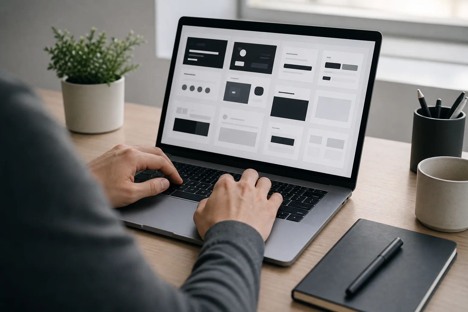
List every reusable component once: buttons, cards, form fields, modals, navigation bars. Give each one a name the developer will actually use in code, like PrimaryButton or ProductCard, not "Button 3 (final) (v2)". Link directly to the live Figma frame, never a static export, so the developer always sees the current version if the design changes mid-sprint.
This inventory becomes the backbone of the whole document. Every other section, states, breakpoints, tokens, refers back to a component named here.
A button has at minimum six visual states: default, hover, active, disabled, loading, and focus (for keyboard navigation). A form field adds error and success states. A list or card grid adds an empty state for when there's no data yet.
Designers often design the happy path and stop. Developers then have to invent the disabled button style or the empty-cart screen on the spot, usually without the same attention to spacing or color that went into the main flow. That's where inconsistency creeps in, and it's the single most common source of the "this doesn't match the design" bug report during QA.
List states in a simple table: component name, state, visual difference from default, and a Figma link if the state exists as its own frame. If a state doesn't exist yet, flag it explicitly as "not designed, use default styling" rather than leaving a blank.
Which breakpoints does the design actually change layout at? A pixel width alone tells a developer nothing about intent. Name the breakpoints your team uses, mobile, tablet, desktop, wide, and describe what happens at each one.
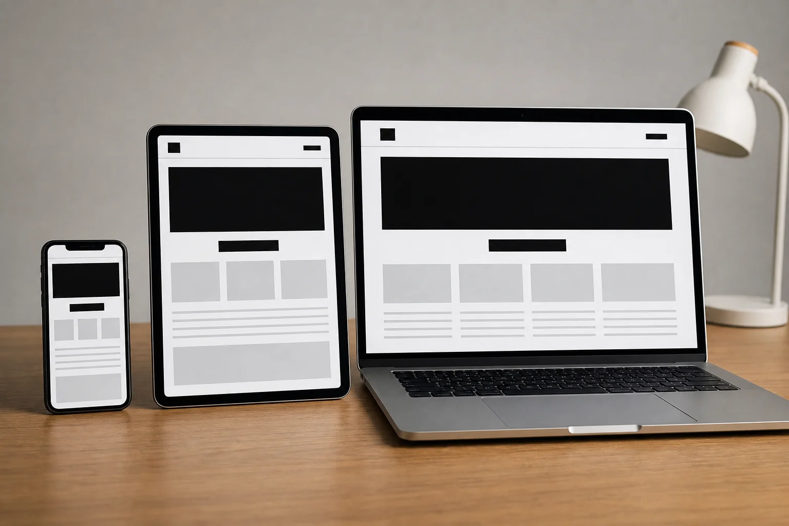
Does the three-column card grid become two columns on tablet and one on mobile? Does the navigation bar collapse into a hamburger menu at 768px, or does it stay visible with smaller icons? Does the sidebar hide completely on mobile, or move below the main content? Write this out in plain sentences next to each breakpoint, not just a screenshot of the mobile frame.
Teams building accessible, responsive interfaces for varied markets know that breakpoint logic left undocumented is one of the fastest ways a build drifts from the design over a multi-week sprint.
Colors, font sizes, line heights, and spacing units should never be something a developer measures with a ruler on a screenshot. Figma's Dev Mode (formerly the Inspect panel) exports exact hex codes, font weights, and pixel spacing directly from the file.
Pull those values into a short reference table or link the Dev Mode view directly. This single step removes most of the "close enough" builds that pass a quick glance but fail a side-by-side comparison against the original design.
If your brand uses a defined design system, name the token instead of the raw value where possible, "spacing-md" instead of "16px", so the codebase stays consistent even as the visual scale evolves later.
Transitions and micro-interactions rarely survive handoff unless someone writes them down. A dropdown that should ease open over 200 milliseconds will just snap open instantly if nobody specifies the timing.
Link to the actual Figma prototype for any multi-step flow, checkout, onboarding, a modal sequence, so the developer can click through it themselves rather than interpreting static frames. Keep the written notes short: "fade in, 150ms, ease-out" is more useful than a paragraph describing the feeling you're going for.
What happens when a product name is 40 characters long instead of the 12 characters used in the mockup? Does it truncate with an ellipsis, wrap to a second line, or break the card layout entirely? What does the empty search results screen say, and what does it look like when an image fails to load?
These edge cases rarely get designed but they get built by someone, either the developer improvising or the designer fielding an urgent Slack message mid-sprint. Write the rules once, up front, and both answers move faster.
The handoff document sits between the Design & Prototyping phase and the Development & Testing phase, acting as the single reference both teams check builds against instead of re-litigating decisions mid-sprint.
At Axire, this is a formal step in the four-phase process: Discovery & Planning defines what's being built, Design & Prototyping produces the wireframes and interactive mockups, the handoff document translates those into a build spec, and Development & Testing works directly from it under agile sprints with regular QA. If the discovery phase wasn't documented clearly, the handoff document inherits those gaps. That's covered in more depth in the Discovery & Planning Phase FAQ, which walks through what a proper discovery deliverable should actually contain before design even starts.
The same handful of mistakes show up on almost every project that runs over budget on the build phase, regardless of the tech stack or the size of the team.

Founders evaluating a new build partner should ask directly how handoff documents get produced and maintained. It's one of the practical questions worth adding to a development partner evaluation checklist before signing a contract.
Use this as a working checklist before a design file gets marked "ready for development":
Teams choosing between building this discipline in-house or picking a tech stack and workflow suited to their project should treat the handoff process as part of that decision, not an afterthought bolted on once development starts.
Figma's Dev Mode is the standard for most teams because it exports exact spacing, color, and typography values directly from the design file. Zeplin and Storybook are common companions for teams that also need a living component library alongside the static handoff document.
An MVP handoff doc can be shorter, but it still needs a component inventory, states for the core user flow, and named breakpoints. Skipping detail on a small build causes proportionally more rework because there's less design polish to fall back on when developers guess wrong.
The designer produces it, since they hold the source file and the intent behind every state and spacing decision. The developer should review it before the build starts and flag gaps immediately, rather than filling them in silently during the sprint.
Handoff discipline matters more, not less, once a team works across time zones, whether that's a Philippines-based team, an India-based team like Axire, or a Sweden-based in-house team. A thorough document is what lets a remote developer start building correctly during their own working hours instead of waiting for a same-timezone Slack reply to clarify a missing state. Teams comparing offshore options for hiring React developers for Nordic-facing projects should weigh handoff process maturity as heavily as day rate.
A design handoff document that covers components, states, breakpoints, and tokens removes most of the guesswork that turns a four-week build into a six-week one. If you're planning a project and want a development partner who treats handoff as a formal step rather than a Slack message, Axire's UI/UX design service builds this documentation into the Design & Prototyping phase by default, and the web development team builds directly from it. Browse past projects to see the process in practice, or get in touch to talk through your next handoff before design work even begins.
Let's discuss your project and create something amazing together.
